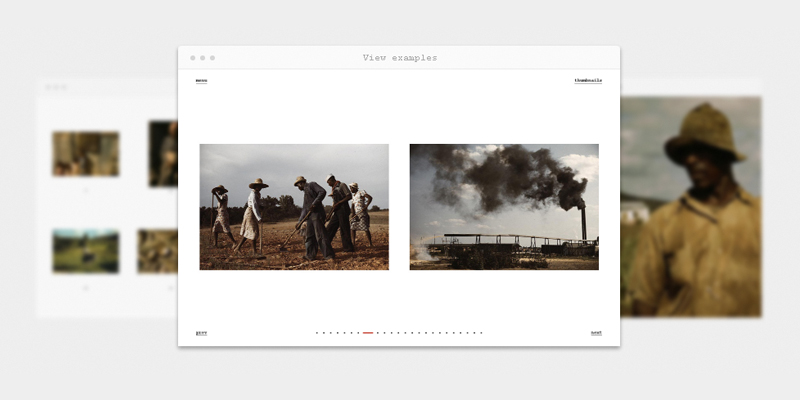
Principles for great portfolio website
(work in progress)
Great portfolio website puts FOCUS on your work only.
Great portfolio website is NARRATIVE. It will encourage you to tell stories.
Great portfolio website is EASE to use. It's designed for simplicity.
Great portfolio website is DOWN-TO-EARTH. It's practical and realistic.
Great portfolio website look up to PHOTOBOOKS for experience, layout, rhythm & flow.
Great portfolio website is like artist's BLANK CANVAS, every single dot counts. Be careful what you add.
Great portfolio website is MEMORABLE because of work featured within, not because itself.
Great portfolio website provides all its space for your artwork, retain nothing for itself. It’s NOT SELFISH.
Great portfolio website is INVISIBLE, your work is only thing visitor notices.
Great portfolio website can’t make your work look better, it’s HONEST.
Great portfolio website is SUPPORTIVE, it elevates content rather than obscuring it.
Great portfolio website is always FIT. It doesn’t consume non-essentials.
Great portfolio website count on your SELF-EXPRESSION. Your own voice matters.
Great portfolio website doesn’t seek for attention. It’s MODEST.
Great portfolio website is INNOVATIVE but respect tradition. It takes the best from current and past.
Great portfolio website is PLAYFUL yet know it's boundaries.
Great portfolio website WON’T WIN you a web design AWARD. It’s invisible, remember?
Great portfolio website is CONFIDENT. It doesn’t follow latest trends blindly.
Great portfolio website BEHAVES. It’s well designed.

Foliodot, portfolio website template,
is heavily inspired by these principles.
Learn more